Comments
/* ... */
Selectors
CSS selectors specify which HTML elements are styled.
- Type selectors select elements by their element type.
/* <p>...</p> */
p { ... }
- Class selectors select elements based on the element’s attribute value.
/* <div class="awesome">...</div> */
.awesome {...}
- ID selectors target a unique element with a specific ID attribute value.
/* <div id="justme">...</div> */
#justme {...}
Combining selectors:
/* targets elements of type p with class="hotdog" or class="burger" */
p.hotdog,
p.burger {
  ...
}
Spaces matter!
p.mustardselects allpelements withclass="mustard"p .mustardselects all elements that are of typepor haveclass="mustard"(independent of their type)
Descendant selectors
/* Any descendant */
header a { ... } /* (targets elements of type a within elements of type header) */

/* Direct child */
header > a { ... } /* (targets elements of type a that are direct children of elements of type header) */

/* Sibling */
header ~ p { ... } /* (targets elements of type p that are siblings of elements of type header) */
/* Adjacent sibling */
header + p { ... }
/* Note that these selectors select p siblings following the header element,
   but do not select p elements preceding it. */
Attribute selectors
/* Element with attribute present, regardless of the value */
a[target] { ... }
/* Element with attribute with a particular value */
a[href="#"] { ... }
/* Element with attribute value containing a given value */
a[href*="login"] { ... }
/* Element with attribute value starting with a given value */
a[href^="https://"] { ... }
/* Element with attribute value ending with a given value */
a[href$=".pdf"] { ... }

/* Combination: targets links of form http://.../folder/...pdf */
a[href^="http://"][href*="/folder/"][href$=".pdf"]

/* Element with one of space-separated attribute values matching */
div[role~="tag"] { ... }
/* e.g. matches <div role="tag button"> */

/* Element with one part of a hyphenated value matching */
div[lang|="en"]
/* e.g. matches <div lang="en-US"> */
The cascade
The cascade determines which properties apply to which elements. It allows styles to be added and overriden.
CSS uses the following three concepts (in that order) to determine which rule takes precedence:
- importance, in increasing order:
- user agent (e.g. browser)
- user (e.g. changed default font-size in browser)
- author (e.g. imported CSS file)
- author
!importantdeclarations - user
!importantdeclarations (most important, so that the user is always able to override properties that would otherwise hamper the accessibility)
- specificity, in increasing order:
- elements, pseudo-elements
0-0-1 - class, pseudo-class, attribute
0-1-0 - ID
1-0-0 - inline styles
The universal selector
*has a specificity of0-0-0.
- elements, pseudo-elements
- source order: if all else is equal, the rule later in the source code is applied
Since the specificity of anchor classes is the same for all of them, their order determines which one is applied last. That’s why they should be specified in the following order:
a:link
a:visited
a:hover
a:active
Inheritance
Font and color properties are inherited, while most others (especially box-related properties) are not.
Pseudo classes and elements
A CSS pseudo-class is a keyword added to a selector that specifies a special state of the selected element. – MDN
Examples:
a:hover,a:active,a:visitedinput:focuse,input:disabled,input:checkedli:first-child,li:last-child(selecting thelielement that is the first/last child)td:first-of-type,td:last-of-typesection:target(targets allsectionelements that have an ID attribute value that is part of a URL fragment, e.g. anchors on a page, like<section id="here", that are referenced like<a href="#here">or<a href="https://example.com#here">)div:emptyp:not(.intro),:not(div)
A pseudo element is one that does not exist in the actual HTML, but the browser will insert it after the initial page rendering
A CSS pseudo-element is a keyword added to a selector that lets you style a specific part of the selected element. – MDN
Examples:
div::before,div::after(which create an inline pseudo-element that is the first/last child of thediv)p::first-line
It needs to have content defined in order to be rendered, even if only content: "";.
Also, pseudo-elements don’t work on replace elements (e.g. img and form elements, such as input, button, textarea, select).
:n-th*(...) pseudo elements allow for specifying a counter using the variable n, which will count up (i.e. 0, 1, 2, ...), or -n, which will count down (i.e. 0, -1, -2, ...). Examples:
element:n-th*(2n)   /* = element:n-th*(even)  */
element:n-th*(2n+1) /* = element:n-th*(odd)  */
element:n-th*(-n+2) /* selects the first two elements (n => 2, 1, 0, -1, -2, ...) */
Colors
- keyword (
black,white,gray,silver,maroon, etc., see MDN > color-value) - hexadecimal: RGB
#rrggbb(or#rgb) wherer,g,b = [1..9a..f]with0black andfwhite (this yields (16^2)^3 = 16.7+ million colors) rgb(0, 255, 0)with0black and255white, andrgba(0, 255, 0, 0.5)where the last value is an alpha channel with0fully transparent and1fully opaque
Lengths
Absolute:
px
A CSS reference pixel has an angular width of a physical pixel on a device that displays 96 pixels per inch, adjusted for some typical viewing distance appropriate for the device.
Relative:
1emrepresents the calculated font-size of the element, so2emis twice the font-size of the element (ifemis used to specifyfont-size,1emcorresponds to the inherited font-size of the element) - note thatems compound when elements are nested1remrepresents the calculated font-size of the root element1vhand1vwrepresent 1% of the viewport’s height and width, respectively (not universally supported, though), and is, e.g., useful for viewport sized typography:
h1 { font-size: 20vw; }
p  { font-size: 2vmin; }
%relates to the length of the same property of the parent element (for paddings and margins it always relates to the element’s width)
Use fallbacks when using units that are not universally supported, e.g.:
p {
  font-size: 20px; font-size: 1.25rem;
}
nav {
  width: 25%; width: 25vw;
}
Default is auto that “determines an appropriate length based on the content and the element’s content”.
Box model
Every element in web design is a rectangular box.
Box sizing
Width and height
The total width and height of the space that a box takes up are per default additive:
- width = content
width+ left and rightpadding+border+ left and rightmargin - height = content
height+ top and bottompadding+border+ top and bottommargin
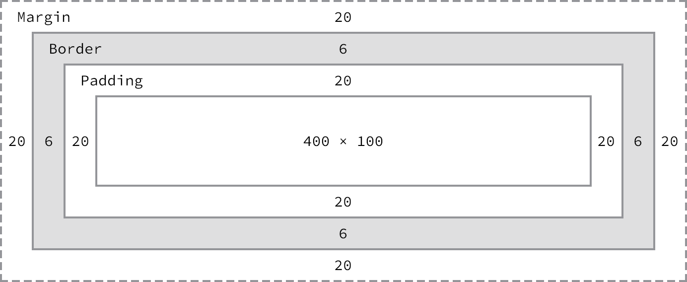
Padding is part of an element, while the margin is not (it’s space between elements). Both padding and margin are transparent. As a result, padding shows the background of the element, margin the background of its container.
Shorthands for margin (and, analogously, for padding):
div {
  margin: 10px;           /* same value for all four sides */
  margin: 10px 5px;       /* top + bottom, left + right */
  margin: 10px 5px 0 6px; /* top, right, bottom, left */
}
If height is specified as percentage, it is interpreted w.r.t. its containing element. If the height of the containing element cannot be calculated, the height property of its child is reset to auto (usually meaning the height that the content requires). Example:
/* Without height on body and html, height of div cannot be calculated. */
body,
html {
  height: 100%;
  /* Without a reset of padding and margin to 0,
     the final height will be greater than the height of the viewport. */
}

div {
  border: 1px solid black;
  height: 100%;
}
Margin collapse
Top and bottom margins collapse when they touch, i.e. adjoining margins of two elements combine to one. For two positive and two negative margins this means that the one with the greater absolute value will be used, while the other one is collapsed to 0; when one margin is negative and one is positive, both are summed up. For example:
- If one element has a bottom margin of
20pxand the element right beneath it one of10px, then the space between them will be20px. 25pxand-20pxleads to5px.-25pxand-20pxleads to-25px. Exceptions areinline-blockand floated elements.
Left and right margins as well as paddings don’t collapse.
Borders
div {
  border: 1px solid #000; /* width style color */
  /* same for individual sides with border-top, border-bottom, border-left, border-right */
}
And border-radius for rounding the corners of an element, where border-radius: 50% will yield a circle.
… box-sizing property:
content-box: the default value, additive, i.e. padding and border are added to the box’s width and heightborder-box: the padding and border are included in the box width and height (this should be used when nesting an element with width100%in another element, because otherwise any border or padding will make it spill out of the parent)
Block vs inline elements
A block-level element always starts on a new line and takes up the full width available – MDN
[B]lock-level elements occupy any available width, regardless of their content, and begin on a new line. Inline-level elements occupy only the width their content requires and line up on the same line, one after the other. – Shay Howe
Positioning:
- Inline elements are placed on the same line, next to each other (until they exceed the parent’s width, then they begin to wrap).
- Block elements begin a new line and are place there by themselves, thus they stack on top of each other.
Sizing:
- The width and height of inline elements is determined by their content (up to 100% of their parent’s width, then they begin to wrap). They cannot be set to a fixed size. Top and bottom margins are ignored (while left and right margins are applied), as inline elements are horizontal. Top and bottom padding is applied, but the content above and below the inline element will not be adjusted, so if an inline element has visible borders and padding, the borders may spill into content above and below the element.
- Block elements have a default width such that width + padding + border adds up to 100%, and a default height that is necessary to accommodate their content.
Nesting:
- Inline elements can contain other inline elements (like
<strong><a>...</a> ...</strong>), but no block elements (only exception:a). - Block elements can contain inline as well as other block elements.
See MDN’s full list of block elements (plus body) and inline elements. Note that img is inline, and that input and textarea are inline in some browsers and inline-block in others.
This is determined by the element’s display property. Each element has a default display property that can be overridden. Most common values:
block(accepting all box model properties, like padding and margins)inlineinline-block(are positioned like inline elements, but otherwise behave like block elements),none(the element and all elements nested inside it are hidden, i.e. the document is rendered as if the element didn’t exist)flexandgrid
The default vertical alignment of inline elements (inline and inline-block) is vertical-align: baseline;, other values are middle and top.
Float
Originally intended for elements like images that text should flow around, no matter what size they have.
See: https://css-tricks.com/all-about-floats/
The float property removes an element from the normal flow of a document, and moves it to the left or right edge of its parent element (or the page if there is no parent). It requires an element to be a block element, and will adapt its display value accordingly if it isn’t.
Non-floated elements appearing after the floated ones will be positioned in the normal flow, and ignore the floated ones - only their content wraps around the floated ones. Example:
<nav>
  <ul>
    <li>Home</li>
    <li>Kapitel 1</li>
    <li>Kapitel 2</li>
    <li>Kapitel 3</li>
    <li>...</li>
  </ul>
</nav>

<main>
  <p>...</p>
  <p>...</p>
  <p>...</p>
</main>
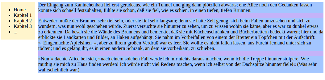
Before floating nav to the left:
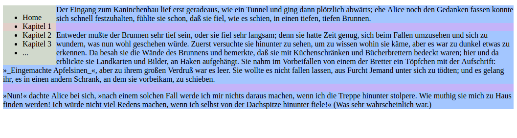 After floating
 nav to the left:
In order for a non-floated box to behave as if the floated one was in the normal flow, it has to clear the float with clear: both | left | right.
Note that when floating an element, order in the HTML document matters. If, for example, an image is first removed from the normal flow, then the following text will wrap around it (see https://alistapart.com/d/css-floats-101/example_h.html):
<div>
  <img>
  <p>
</div>
But if the text is first set and the image is removed from the normal flow afterwards, it will affect the following elements but not the text (see https://alistapart.com/d/css-floats-101/example_i.html):
<div>
  <p>
  <img>
</div>
Also note that since floated elements are not in the normal flow, they don’t affect the size of their parent element. Therefore containers with only floated elements in them, collapse - as far as the container is concerned, it’s empty. That’s also the reason why the image in the second example sticks out of the box.
In order to contain floats, the containing element needs an element that clears the float. This can be done using pseudo-elements (see micro clearfix):
.group::before,
.group::after {
  content: "";
  display: table;
}
.group::after {
  clear: both;
}
/* where class="group" can now be used on any parent element containing floats */
An alternative is to use overflow: hidden on the container, if it contains only floated elements and nothing else.
Floated elements without a specified width will take up as much space as their content needs.
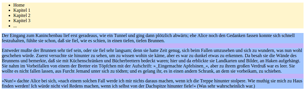
Column layout with floats
In the above HTML example, applying a left margin to main leads to:
 Since the margin area takes the background color of the containing element, this gives the impression of two columns.
Horizontal lists with floats
Each floated box is taken out of the normal flow and floated as far up and left/right as possible, so consecutive floated boxes will appear next to each other (until they fill the width of their containing element, then they begin to wrap, called float drop).
<ul>
  <li>Item 1</li>
  <li>Item 2</li>
  <li>Item 3</li>
  <li>Item 4</li>
</ul>
When applying float: left to li:

Positioning
For floats, see the section above.
Position
-
position: static;is the default and means that an element is placed within the normal flow and doesn’t accept box offset properties. All elements with a value different fromstaticare said to be positioned, while a static element is not positioned. -
position: relative;(together withleft,right,top,bottom) will move the element from the original position of the element in the specified directions, while- preserving the space the element would have originally taken (so other elements cannot move into that space)
- not adjusting the position of other elements - as far as the other elements are concerned, an element with a relative position is in its non-offset position
Without any of the propertiesleft,right,top,bottom, a relatively positioned element is placed exactly like a static one.
-
position: absolute;positions an element according to the specified box offsets relative to its closest positioned ancestor element (orbodyif there is none), i.e. relative to its closest parent with a position other thanstatic. It removes the element from the normal flow, so you can put it anywhere, and it won’t affect or be affected by any other elements in the flow. In particular:- its original position and space are not preserved
- other elements are not affected, so the positioned element might overlap them
-
position: fixed;works the same asabsolutebut with respect to the viewport and not a parent element. E.g., an offset oftop: 0; left: 0; right: 0;gives a fixed header.
In order to center an absolute or fixed element:
element {
  width: 200px;
  position: absolute;
  top: 0;
  /* move the left offset to the center, and then move it back by half the width of the element */
  left: 50%;
  margin-left: -100px;
}

/* With CSS transform if the dimensions of the element are dynamic: */

element {
  position: fixed;
  top: 50%;
  left: 50%;
  transform: translate(-50%, -50%);
}
Others
For horizontal alignment of elements, changing them to inline-blocks is usually sufficient. Use floats only when content is supposed to wrap around an element.
Also see: flex and grid properties
Overflow
The overflow property specifies what happens when an element has a fixed size and the content doesn’t fit into it.
visible(the default) renders the content, which then flows outside of the box (but without affecting other elements)hiddenhides any content that extends beyond the box (and self-clears all floats in the element)scrollandautomake the overflowing content accessible via scrollbars, whereautoshows them only when they are necessary, whilescrollalways shows them (independent of whether they are needed).
Mobile first: Write CSS for mobile version and use media queries to add rules (and images, etc.) for larger screens. This way, load time and bandwidth use on mobile devices can be minimized.
Importing CSS with media queries
HTML:
<link href="file.css" rel="stylesheet" media="media-query">
CSS:
@import url('file.css') media-query;

@media media-query {
  ...
}
Syntax
media-query := (logic)? media and (media features)

logic := only | not
media := screen | projection | print | ...

media features := feature
                | feature : value
Features include, among others, device orientation:
orientation : portrait | landscape
and width:
           width: 600px;
       min-width: 400px;
       max-width: 800px;

    device-width: 600px;
min-device-width: 400px;
max-device-width: 800px;
Where width refers to the width of the viewport, and device-width refers to the width of the screen (independent of device orientation).
And analogously for height.
Example:
/* Include background image only if the viewport provides enough space */

@media screen and (min-width: 400px) {
  h1 {
    background: url('large-image.jpg');
  }
}
Expressions can be composed with and and , (meaning or). For example:
/* screen that has (a min-width of 400px or orientation landscape) and a max-width of 800px */
@media screen and (min-width: 400px, orientation: landscape) and (max-width: 800px) {
}
Guidelines
Also see Shay Howe’s guidelines.
Only be specific when you need to be.
- Start with the least specific selectors, and add more specific ones only if the need arises. Very specific rules paint you into a corner.
- Prefer classes over IDs, unless something is really unique, like a hook for JS.
- Prefer simple layering over nesting, for example:
/* <div class="flash flash-success"> ... </div> */

.flash {
  font-size: 19px;
}

.flash-success {
  color: green;
}
.flash-error {
  color: red;
}
Never rely on source order.
Use a reset or baseline CSS as starting point. Otherwise each browser will present you with a different environment.
Be expressive and clear.
- For the sake of flexibility, the names of classes and IDs should express the purpose of the element.
Always use semantic names. Never use presentational names.
- Also, add comments, especially for dividing the CSS file into sections that help navigate through the document.
Examples
Backgrounds and images
Not all browsers support rgba colors (e.g. IE8), so provide a safe fallback as well.
div {
  background: #b2b2b2;
  background: rgba(0, 0, 0, .3);
}
Use border-radius: 100%; to create circular images.
Scaling an image when viewport gets smaller than image size:
img {
  max-width: 800px;
  width: 100%;
}
Image sprites
Include the sprite sheet as background image and shift it using
background-position: <pixels shifted right> <pixels shifted down>;. For example:
.button {
  background: url("button_sprite.png");
  height: 20px;
  width: 20px;
}

#button,
#button1 {
  background-position: -20px 0px;
}

#button:hover,
#button2 {
  background-position: -40px 0px;
}
Centering content
Horizontally:
.element {
  display: block;
  margin: 0 auto;
  /* usually together with max-width */
}

/* or with FlexBox */
.parent {
  display: flex;
  justify-content: center;
  align-items: center;
}
In the center of the page:
img {
  display: block;
  position: fixed;
  top: 50%;
  left: 50%;
  transform: translate(-50%, -50%);
}
For more comprehensive information, see CSS Tricks and W3C.
Containing floats (aka clearfix)
.group::after {
  content: "";
  display: block;
  clear: both;
}
.group {
  overflow: auto;
  zoom: 1;
}
Floats vs inline blocks:
If a parent element contains only “floated” elements,
display: inline-block and float: left, overflow: auto both achieve the same thing
(where the former displays whitespaces between the elements while the latter doesn’t).
Lists
/* How to style list elements with a custom style (with fallback bullets) */
ul {
  list-style-type: disc;
  list-style-image: url("arrow.png");
}
/* or short-hand */
ul {
  list-style: disc url("arrow.png");
}

/* Alternative, with a bit more control on positioning and spaces */
ul {
  list-style: none;
}
ul li {
  background-image: url("arrow.png");
  background-repeat: no-repeat;
}

/* How to spread a list horizontally, e.g. for a nav bar */
li {
  display: inline-block;
  margin: 0 10px;
}
/* display can also be inline, e.g. to include a list into running text,
   but then no margin can be added */
Margins between list elements:
li + li {
  margin-top: 1em;
}
Also see * + *.
Forms
/* mark required input fields more prominently than optional ones */
input {
  border: 1px solid #eee;
}
input[required] {
  border: 1px solid #000;
}
/* mark the input field that is currently edited */
input[type="text"]:focus {
  background: #e5ff89;
}
/* highlight the checked checkboxes */
input[type="checkbox"]:checked + span {
  background: #e5ff89;
}
Tables
/* Color alternating rows */
tr:nth-child(even) {
  background: #ccc;
}
tr:nth-child(odd) {
  background: #fff
}

/* Center text in all columns but left-align it in the first column */
tbody td {
  text-align: center;
}
tbody t:first-of-type {
  text-align: left;
}
WTF?
Table rows,
<tr>s, do not receive borders unless you setborder-collapse: collapse;on the parent<table>. Moreover, if the<tr>and children<td>s or<th>s have the sameborder-width, the rows will not see their border applied. – http://wtfhtmlcss.com/